Weekly Wrap - Week ending 6 May, 2022.
XJO Monthly Chart.
The first week of May has been a poor result. On the monthly chart, XJO is down -3.09% and, most importantly, has fallen below the 8-Month EMA. Now, that only provides signals for long-term investors at the end of the month. But this requires evaluation at the end of the month.
That may seem like a long time, but, for long-term investors it is sufficient to protect funds.
Hull MA13 remains bullish. Supertrend (1.5/7) remains bearish where it has been since the beginning of January.
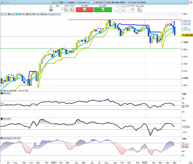
Weekly Chart.
XJO was negative this week, -3.09%, the third week down in a row.
This chart is bearish. This week's candle has switched Hull MA13 to blue (bearish); Supertrend (1.5/7) is blue (bearish) and the chart is below the 8-Week EMA which has turned down (bearish). RSI and CCI are below their mid-lines (bearish) and Stochastic has fallen below its signal line (bearish).
That's a dreary outlook.
The chart shows a trading range in round figures from 7630 to 7170. This week XJO finished at 7206. So we could be looking at a bounce in the near term. Next level of support is at 6980. That seems a likely target for this medium-term movement.
Daily Chart.
Friday was a serious down day for the XJO -2.16% .
Of interest on this chart are the Positive Divergences on CCI and Stochastic.
They are arriving as the chart approaches horizontal support 7170. In fact, Friday's candle had a small bounce off that level on Friday. So we may see consolidation and a counter-trend rally in the next few days.
Sector Changes - past week.
This chart shows the performance of each sector (plus Gold Miners, XJO, BEAR and IAF) over the past week. XJO was down -3.09%.
All eleven sectors were down, although two were down only marginally: XUJ -0.3% and XEJ -0.07%.
XPJ (Property) was hard hit, -8.18%. (That's not the same as Housing, although it does include two big developers of Housing: Stock Land -6.25% and Mirvac -6.61%.) Goodman, an international property, management and development company with properties around the world, fell the most -14.1%. It has formed a large head-and-shoulders chart formation which suggests more downside.
Serious falls also occurred in the following sectors: Information Technology -5.99%, Telecommunication Services -4.67% and Consumer Discretionary -3.91%
New Highs - New Lows Cumulative.
NH-NL Cumulative continues to fall and is now falling steeply under its 10-Day Moving Average, that's a big red danger sign for long-term investors.
Below is a chart of % NH/NH+NL:

10-DMA of %NH/HN+NL is now the lowest it has been in the past 18 months. As a contrarian indicator, that suggests we are near a low.
% of Stocks above key moving averages.
1. % of stocks above 10-Day Moving Average, 15%.
2. % of stocks above 50-Day Moving Average, 48%.
3. % of stocks above 200-Day Moving Average, 43%.
All three are above 50% level - which confirms the bearish status of the ASX
Back in late January, we had two weeks in a row where % of Stocks above 10-DMA fell below 15%.
That suggests, perhaps, another week of falls before a strong rebound
Offence or Defence?
The above chart compares the performance of XSJ Consumer Staples (yellow and blue candles) with XDJ Consumer Discretionary (blue and grey candles).
If consumers are confident about the economy, they are usually happy to splurge on big ticket, discretionary items - companies such as Harvey Norman, JB Hi-Fi and car retailers. If consumers are not so confident about the economy, consumers tend to delay buying big ticket items.
Consumer Staples are much more resilient to lack of confidence in the economy. While they may delay purchasing a new refrigerator or Apple computer, consumers will still buy toilet paper and breakfast cereal. In Australia, big retailers like Woolworths and Coles dominate the Consumer Staples market.
We can see in the above graph, that XDJ and XSJ were more or less in sync from May 2021 until February this year, when XSJ chart began to dominate the XDJ chart.
That suggests that investors need to take on a more defensive posture than they had last year.
Conclusion.
1. The monthly, weekly and daily charts are more or less in sync - bearish.
2. XSJ/XDJ suggests a defensive posture in investments.
3. Contrarian indicators and support levels suggest the Australian market is at or close to a "bounce" level. That will probably be a case of sell-the-rally.
Stay defensive until the market conditions improve.


No comments:
Post a Comment