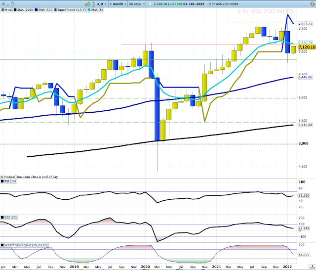
XJO has strengthened in the short-term. Bearish conditions remain.
XJO Monthly Chart.
In January, the monthly chart showed a sell signal for both the Supertrend (1.5/7) and the 8-Month EMA.
Despite a good result in the first week of February, the XJO monthly chart remains below both the 8-Month EMA and the Supertrend.
Weekly Chart.
XJO up this week +1.89%.
So - XJO is now locked between two major support/resistance areas. The most likely scenario will be for the XJO to test resistance at 7168 and then fall again. XJO is currently at 7120.
Daily Chart.
In the short-term, XJO is doing well. A strong week has taken the XJO back above its 8-Day EMA and given a buy signal by crossing above its Supertrend (1.5/7).
But, there are plenty of cautions lie in this chart. Just overhead is a major resistance level. Above that we have a "death cross", where the 50-Day MA has crossed below the 200-Day MA.
The "death cross" predicted major bear markets in 1929, 1938, 1974 and 2008. It is not, however, always reliable. A "death cross" occurred in March, 2020 - which failed as a predictor with the market rebounded strongly into a bull market which has only recently ended. Take it for what it's worth - another warning sign.
We now have the short-term trend rising, with longer term trends still bearish. The current short-term trend could be the start of something bigger, or it could be a counter-trend rally which will fail. Still - time to be cautious about plunging money into this market. More information about this further on in this report
Sector changes this week.
All eleven sectors were up this week, with the best performer Energy (XEJ +4.93%). The increase in XEJ also dragged up Utilities (XUJ +4.4%). The two worst performers (relatively) were Financials (XXJ +0.99%) and Consumer Staples (XSJ +0.97).
New Highs - New Lows Cumulative.
NH-NL Cumulative remains decisively below its 10-Day Moving Average. Until it breaks back above its 10-Day MA, this indicator suggests that long-term investors remain defensive.
The bearish reading on the NH-NL Cum is confirmed by Strong-Weak Stocks Chart which moved up a little this week but remains below its 5-Week MA.
Bonds versus Stocks.
The Stocks/Bonds Ratio chart moved up this week, but remains well below the zero line. We need to see this ratio above zero to prefer stocks over bonds.
This doesn't necessarily mean an either/or situation. But does help in deciding allocations between stocks and bonds for long-term diversified investors.
Stocks above key moving averages - last week and this week
A look at the number of stocks in the ASX100 above key moving averages provides an idea of how bad thins are.
ASX100 stocks above 10-Day MA: Last week - 6%. This week - 69%.
ASX100 stocks above 50-Day MA: Last week - 20%. This week - 33%.
ASX100 stocks above the 200-Day MA: Last week - 32%. This week - 40%.
Until we get all figures above the 50% mark, we'll assume that we are looking at a counter-trend rally
Conclusion.
We had a strong counter-trend rally this week. It could be the start of something bigger but we need to see more evidence before concluding that we are back in bull market conditions.
Stay safe. Good trading


